(1220) Part of this post will be political stories but part is to chat about the set up in the light of a new project tried and ditched. I’m in bed ill-ish, blogging from here on ipad. Slowly. (1428)
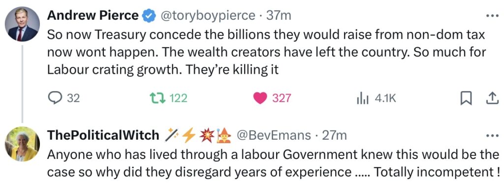
15. Ladies for afternoon tea
Only two pictures, interesting, of fellow Xers … very strange poses.
Check the feet:

And with this gal … is it the logo of interest?

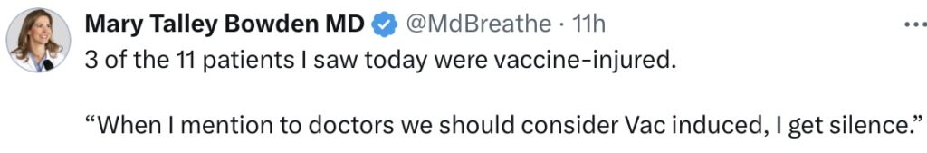
14. Steve at 822
Big Tish James is back in the news, she’s the crooked New York Attorney General who swore to “get Trump” when she ran for that office. It’s not looking good (for her) on the appeal of the civil fraud case which ended in Trump being fined $355 million in damages …
JH: more over there, inc. link.
13. The latest project testing here at unherdable holdings limited (of brain)
Time to come clean … a bit. Part of this new fun cybersystem here is we can try out website builds to one side while Unherdables continues to do its thang … most useful indeed, as well as having our own search engine. Plus various failsafes.
Right, so I was playing with Ghost … my mate loaded, I played. Ghost is a perfectly acceptable CMS (content management system) for someone at intermediate coding level. In skiing terms, it’s red intermediate slope, whereas I’m blue/red, which is middling-good, no way expert (black).
Now, Ghost is just raw code and so a nice front page can be set up … except … there are no bleedin’ comments on offer, unless you get one, called discourse, and enmesh it … that takes coding skills. For me … a pain. Ghost simply offered no comments thread. Whaaaa?
Which leads to the difference between comments and forums. Forums (fora) are best for expertise chats, i.e. you need to know the best way … go to ghost forum or “headline” forum (a theme not offered but gettable in zip form) … ask your questions.
Where they fall down, fora, when used as blog comments, is that they need reader registering and logging in every single time. Also, our model at Unherdables is not that you would go through all that each time, just to see if anyone’s posted something interesting on the forum … there’s a certain amount of shooting blind there.
This is why sidebar “latest comments” is so important … you only need one click to get to HQ in the first place, glance at comments, start scrolling down (remember I must make this not endless). If there’s anything at NOWP, I signpost that, ditto with UHC or Jstack (nothing today so far by the way at those two, as I’m ill in bed).
Fora do not allow that, they’re blind entry, by definition, plus ugly … plus the last point now:
Both Jstack and Ghost work on a model where you, let’s say you’re a blogger, want your readers’ money, you just gotta have oodles of it … or else you want your readers all signed up, their details now sellable for hackers. Plus it’s assumed that you, this new blogger, wants maximum traffic, never mind how many bots, trolls, dumbos pile in, riff-raff from anywhere … and they all argue and insult each other.
It’s a totally different model to Unherdables.
Here, we have regulars who know the ways of the others … we don’t want, we don’t need, “blind” traffic … we’re a tavern which a certain clientele find to their taste and the beer’s not bad.
Now, in Ghost, the set up stage involved over half how to sign up to this or that in order to maximise my “message”. Ain’t got no message, I’ve the running of a friendly tavern where discussion sometimes gets willing but mainly it’s an alt-source of checked out news … that’s it. Trolling and baiting would only get in the way … your maniacal thirst for traffic in the new blog models would be a giant turnoff in ours, quite against our blogging model here. Bad enough with substack.
So you see … nearly all “modern” blog sites, blog themes, have lost the plot imho. There was one theme only on offer at Ghost working anything like this one … ditto at WP themes library. No one seems interested in just the main blog big column on the left plus sidebar layout on the right anymore … not snazzy enough for modern cool dudes. Today, you need designer front pages with masses of white space … why?
Look, you come into a blog … you want the first post to start just under the narrow navbar, you want latest comments in the sidebar. The picture there is just a concession to pretty colours. You have an opening window, right? You want to decide interesting or not without needing to scroll. At least … that’s so with me.
And who needs Read More lines? I want to be able to scroll down and see all the day’s doings aqap.
Upshot was I ditched Ghost. Shall I try Joomla or the dozen others? Sorry but seems to me that WP and Blgr are still the best … but there’s a heavy price though, innit? “Community wokery”, though to be fair … WP is far better with this.
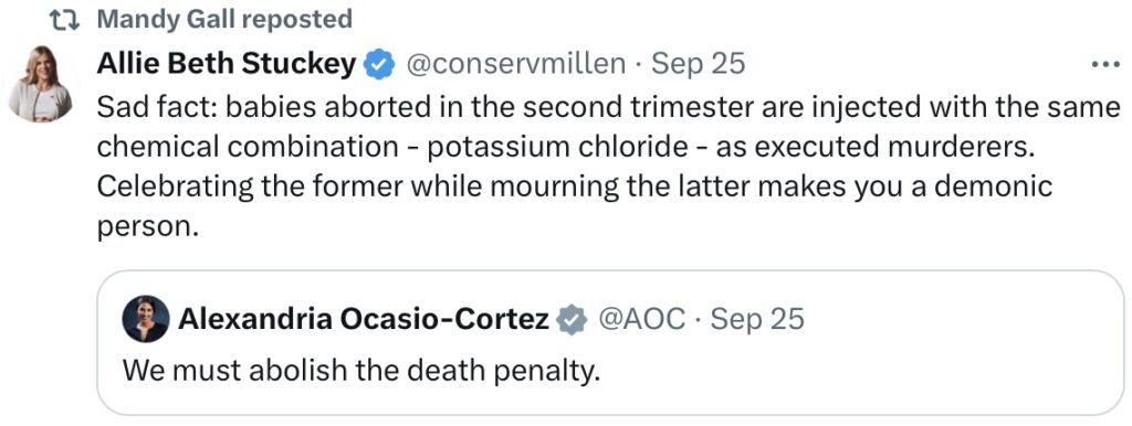
12. The unlettered screenshots with no links (roundups)
If you scroll down to the Alex Bath piece on Starmer’s BS, where Alex asked was there any need to comment … no there wasn’t any need … it was all in the screenshot and needed no link.
Now, Denileriverafter has this Brad Paquette posting with just the text below but I’ve run it instead as the link and the link expands as you see below, with everything included:
“..It looks like Gretchen Whitmer leveraged the office of the Michigan Governor to send out disinformation alongside mail-in-ballot applications intended to solicit votes from inactive voter registrations like that of my mother’s maiden name from the 70s.
Gov Whitmer sent a letter to the house my mom grew up in (a hard dem household) claiming that freedom and voting rights are at risk, to then implore the reader to sign a prefilled application allowing a ballot to be sent to seemingly any location, permanently, based upon a signature. ..”
2:21 PM · Sep 23, 2024
Now we get into an argument here … you can click that letter and if on X, enlarge it … but not if not on X. And do you actually need all that extra page space? Because it means it exponentially increases the scrolling required for the reader, given the sheer number of topics we cover.
Plus there’s the time involved. The Brad P link was a one click thing … easy on me, not cumulatively easy on the reader. So both methods have their annoyances. Here’s a mini roundup in our regular style:

I’m suggesting, reader, that as there are no links involved or provided by them, as said links are not necessary in order to get the general idea, then that’s fine, as long as it’s four, max five.
Now, just had a criticism from one our regulars that it’s all sorts of topics in the one post … that apparently does his head in and fair dos if that’s so … sorry me.
The only way I have around that is a separate number for every single item. Fine for the reader … not so good for me and here’s why … every new subheading is purple. There is no autosetting at this WP theme. For every heading, I must turn the ipad into portrait, click select, click bold, click colour bar, click the second panel, click the hexcode panel, use delete to take away the default six letters and numbers, type in six new ones, save …
… which creates a revision with WP … which is a complete “shot” of the post, each one occupying disk space. Multiply that by every sub heading in the post, times the number of posts in the day … you getting the idea?
Now it’s all well and fine saying to me, “I’m not interested in your blog issues, Jimbo.” Fine but they’re still issues for a’ that. And there’s the rub. On the other hand, with DAD and Steve, I do put in a, b, c, d … which does make it easier all round … readers understand that it is a different topic on each issue.
I’ll try that way with roundups for awhile.